One of my goals for 2016 is to speak at a local SQL Server User Group and a SQL Saturday event. Am very glad both of my goals did come to fruition before end of Q2.
I wanted to pick a unique topic for my presentation and Power BI Desktop Fundamentals was an apt choice for it. It was a new tool and very less people know about it and hasn’t been presented in my local user group. I focussed on developing a 101 course on Power BI covering the basics from top features, creating dashboards and story telling with it.
I got an opportunity to present it on April 19,2016 at Charles I. Ecker Business Training Center of Howard Community College for Baltimore SQL Server User Group.
This was how I looked while presenting:)
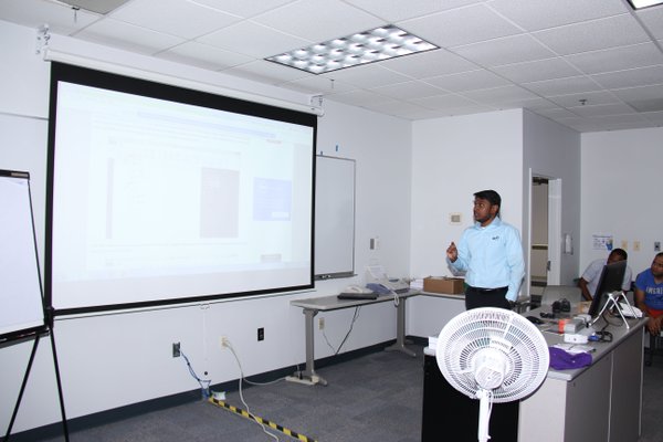
Had to rush to the meeting after my work hour and while setting up the projector it didn’t work, I got very tensed and found a work around..phew!! FInally when I started presenting everything got settled!
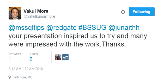
Out of humility, I should say it was huge success and no one slept in the room:) Lot of good questions from the audience and I was surprised to see many companies have started to use it.
I was deeply moved by the comments.

Thank you Jeremy Kadlec and the Sponsors for giving me the opportunity.
Speaking at SQLSaturday Baltimore;
On April 30, 2016 I got a chance to speak at SQL Saturday Baltimore BI Edition, it was a dream come true moment to share the stage with MVP’s and other expert.
We had a nice Speakers Dinner at a Turkish restaurant and hundreds of people attended the conference next day, the whole event was organised by huge efforts of Slava Murgyin and Ravi Kumar, kudos to their hardwork.

My Badge!!
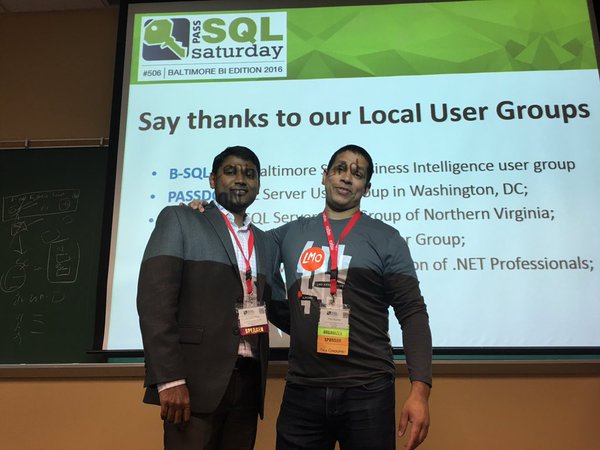
With Ravi
I was really motivated by these opportunities and want to keep this going and during Q3 I want to take it to next level and present a Power BI Advanced topic.
Hope I do it!!